Spring 2021
Saggi Financial Solutions
Insurance Services
Background
Sonika Saggi is a Financial Advisor based out of Surrey, BC, and has worked full time in the life insurance and financial services industry for the past 20 years.
Objectives
Sonika approached us with the desire to revitalize her digital presence and attract clients in ways above and beyond traditional word-of-mouth. In particular, she wanted to expand her customer base to include younger families who had grown up with the internet and had a keener eye for the quality of a brand's digital presence.
Process

1. Site Audit
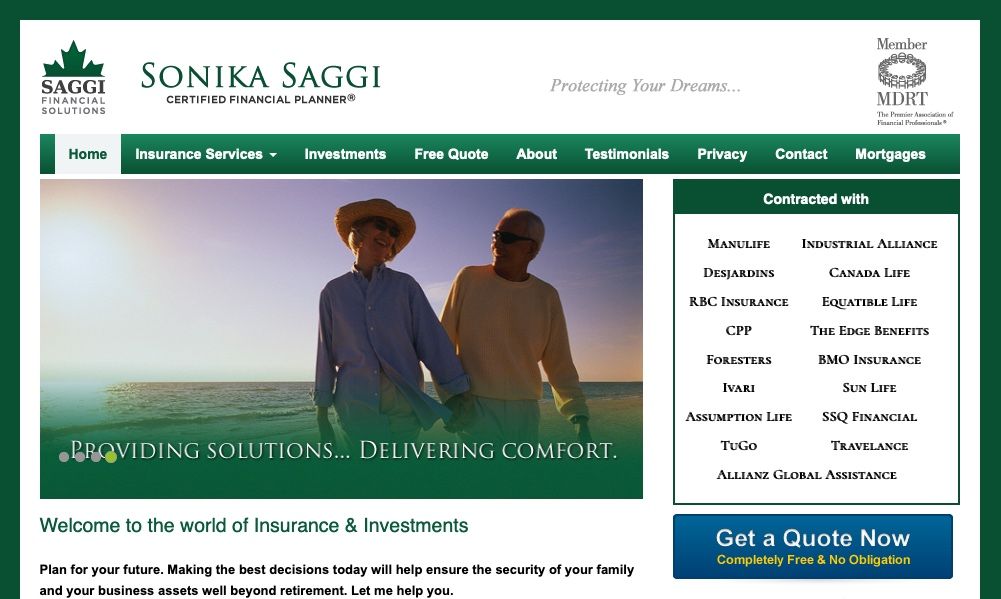
All of our projects begin with a discovery meeting in which we review the current site and the major pain points for us to address. Outdated design, confusing information hierarchy, and broken pages were quickly identified. Having aligned on the project goals, we proposed a simpler website with a fresh new brand to go with it. Other important changes we prioritized were faster load times, easy-to-use interactions, and a seamless mobile experience.
2. Brand Design
Given our target audience of largely younger families, we agreed that the brand needed to communicate security, growth, and warmth while maintaining a modern and minimal look. The logotype pairs a simple sans serif typeface with a bright green leaf to provide contrast and balance. A subtle gradient throughout all visual elements ensures consistency and provides a sense of motion to graphic elements, even in print.
3. Interaction Design
The primary goal of this website was to start a conversation with potential clients that could turn into a meaningful relationship. To break the ice, we implemented a friendly contact form that offers visitors with a free quote from Sonika. The form walks the user through the questions one simple step at a time, requiring only information that would help Sonika deliver a comprehensive quote. The completed form is delivered to Sonika via email, making it extremely convenient for her to work on the quote and make a new connection.
4. Implementation
The website was built using Craft CMS, our content management system of choice. It let us develop and iterate quickly while providing an intuitive user interface for Sonika. This gave her the independence to update her own website's content, minimizing the need for recurring services.
Results
Through updated modern design, Sonika now has a website and brand that reflects her state-of-the-art services.

Lighthouse results
Using modern web development methods, we made measurable improvements to sonikasaggi.com's Google Lighthouse score. This score is based on the website's performance, accessibility, and use of best practices and is an important factor in the site's search ranking.
Testimonial
Q5 did an amazing job creating my new website! Sandy and Josh pay attention to details and have all modern ideas. They are experts in User Experience and understand what the market needs. I had a dated website and was looking for an upgrade! They worked very closely with me, understanding my needs carefully. The upgrade was beyond my satisfaction and they followed all time lines. Their work and attitude are both very professional and I would happily recommend Q5 to all my business friends.
— Sonika Saggi